

Explore Dashboard
Dive deep into HUMAN-detected trends by creating your own customizable tables and graphs.
This article is only relevant for the new Explore dashboard. For information on the legacy Explore dashboard, see Explore Dashboard (Legacy).
The Explore page manages everything from view creation to reporting, and visualizes traffic data analyzed by each of HUMAN’s products, from IVT to insights and compliance. You can create custom views that offer a dynamic overview of your traffic and schedule reports based on view data. You can find the Explore page on the left-hand navigation menu of your dashboard.
There are several distinct widgets that manage different parts of your data visualization. Select a widget below to jump to its detailed documentation:
- Views Management: Select, create, organize, and save your custom data views.
- Filter Bar: Query specific data using Fields, Metrics, and Date Ranges.
- Reports and Alerts: Generate one-time or scheduled reports based on your view data.
- Chart Settings: Manipulate how your data is visually displayed.
- Data Table: Review and export your raw tabular data.
View Management
This is the top menu where you select, create, and organize your custom data views. Use the view management panel to create new views or load an existing view.
-
Add new: Create a new view template using your current dashboard settings. This action will reset any unsaved options you currently have selected.

-
Load Views: Load any of the pre-existing views provided by HUMAN, your company, or any other saved view:
- HUMAN: Pre-configured system views provided by HUMAN. These cannot be modified but can be used as a template to create new views with more filter options.
- Company: Specific view options available to you from within your organization.
-
Manage Views: Click on the Manage Views button to expand the view management widget.
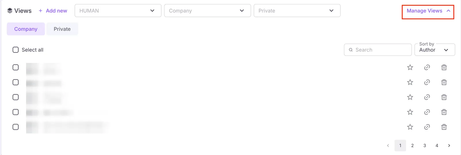
Filter the view options by privacy access:
- Private: Available only to your account.
- Company: Available to your entire organization, meaning others can edit, clone, and create reports from it.
-
Set Default: Click the
 icon next to a view to set it as the default view when navigating to the Explore page.
 -
Delete view: Click the
 icon next to a view to delete the view.
 -
Copy view: Click the
 icon next to a view to copy the full URL to clipboard.
 -
Save: Save the current view and any adjustments you have made to its parameters.
-
Save As: Save a copy of the current view under a new name without overwriting the original version.
Filter Bar
The Explore dashboard contains options for better analysis and reports, including selecting DataSource, Category, Fields, Metrics, Date range, saving and running your view, and more.
Use the filter bar to define exactly what data you want to pull into your view.

-
DataSource: If you’re using multiple HUMAN products, use this option to select which product’s data to include.
-
Category: Uses Aggregate data to highlight general trends and traffic patterns.
-
Fields: Fields dictate how your data is grouped (e.g., by user platform, campaign ID, or device type). Fields are organized into categories such as Timestamp, Client Defined, IVT, and Overrides (with additional categories available under Traffic Insights). Use the search bar at the top of the menu to quickly find specific fields. For certain fields, you can also click Show More to expand and view additional options.
-
Field filters: Apply filters
 to customize your view by including or excluding specific fields based on exact data values. When configuring a filter, you can define the following:
- Operator: Use the dropdown menu (e.g., Is) to define the filter’s logic.
- Values: Type your target data values into the text box. You can add multiple values simultaneously by separating them with a comma and pressing Enter.
- Combine filters: Click the + button next to a row to add multiple conditions to a single filter rule, or click ⊕ Add Filter to create an entirely new filter category.
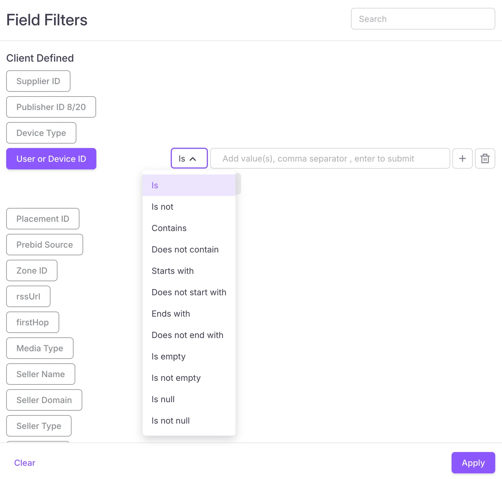 After configuring your conditions, click Apply to add the filters to your view, or click Clear to reset your options.
 -
Metrics: Choose the metrics to include in your view. Metrics provide further numerical insight into your selected fields.
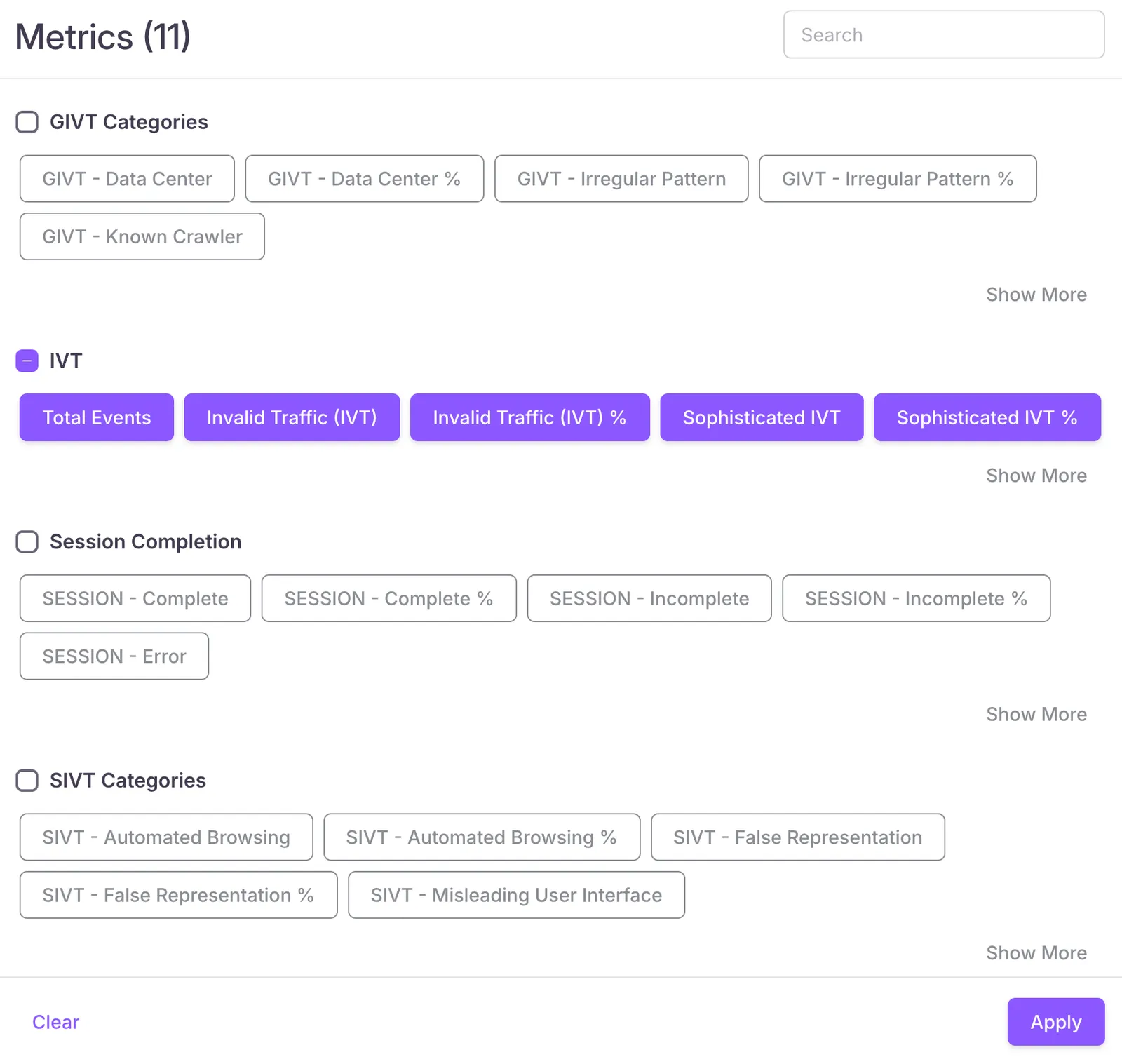
-
Metric filters: Apply filters
to further customize your view by including or excluding data based on specific numerical thresholds. Use the search bar at the top right to quickly locate specific metrics. When configuring a metric filter, you can define the following:- Operator: Use the dropdown menu (e.g., < Less than, = Equals) to define the mathematical logic for your filter.
- Value: Type your target numerical value into the text box.
- Combine filters: Click Add Filter to add multiple numerical conditions to the same metric category. After configuring your conditions, click Apply to add the filters to your view, or click Clear to reset your options.
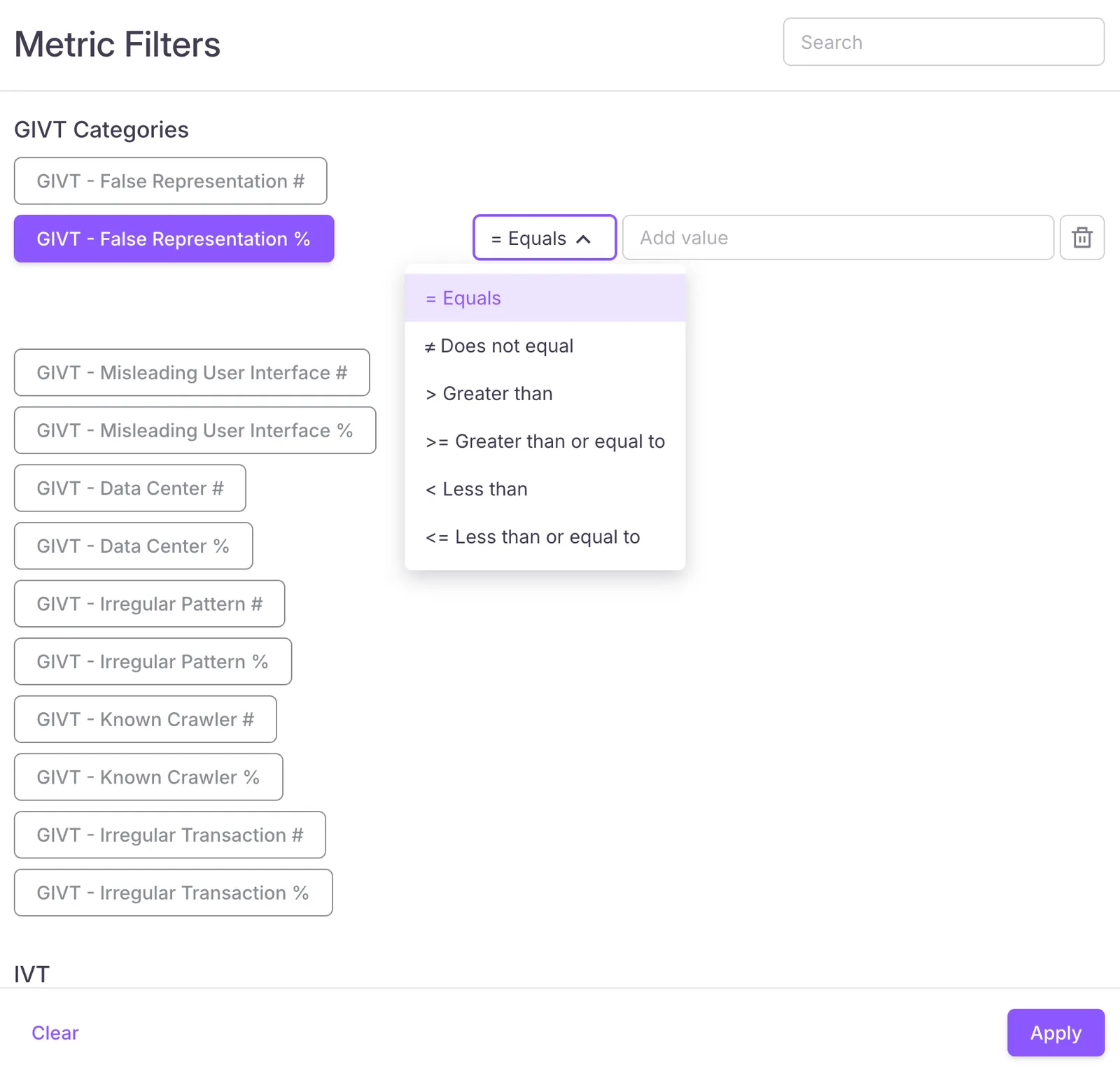
-
Date range: Sets the time frame of your view using one of several preset date ranges or a custom date range on the calendar.
-
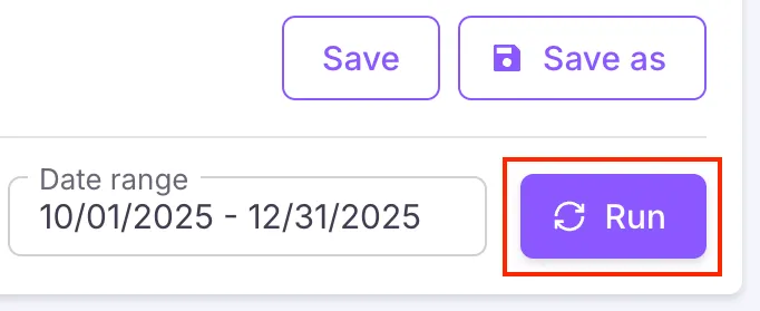
Run: Fetches the data associated with your parameters and view.
Your data will not automatically update. If you ever make changes to your fields, metrics, or date ranges, be sure to click Run again to load the new data.
Reports and Alerts
Reports are downloadable files generated from custom views on the Explore page of the HUMAN Dashboard, run either on a one-time basis (ad hoc) or as part of a recurring schedule. You can download these reports on the Reports page of the Dashboard.

-
Report: Click to generate a new report based on the created or edited data view. You can find and manage the reports created on the Reports page of the HUMAN dashboard.
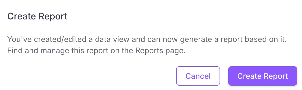
You cannot generate a report until after you save your view for the first time. Reports are always based on the last saved version of the view.
-
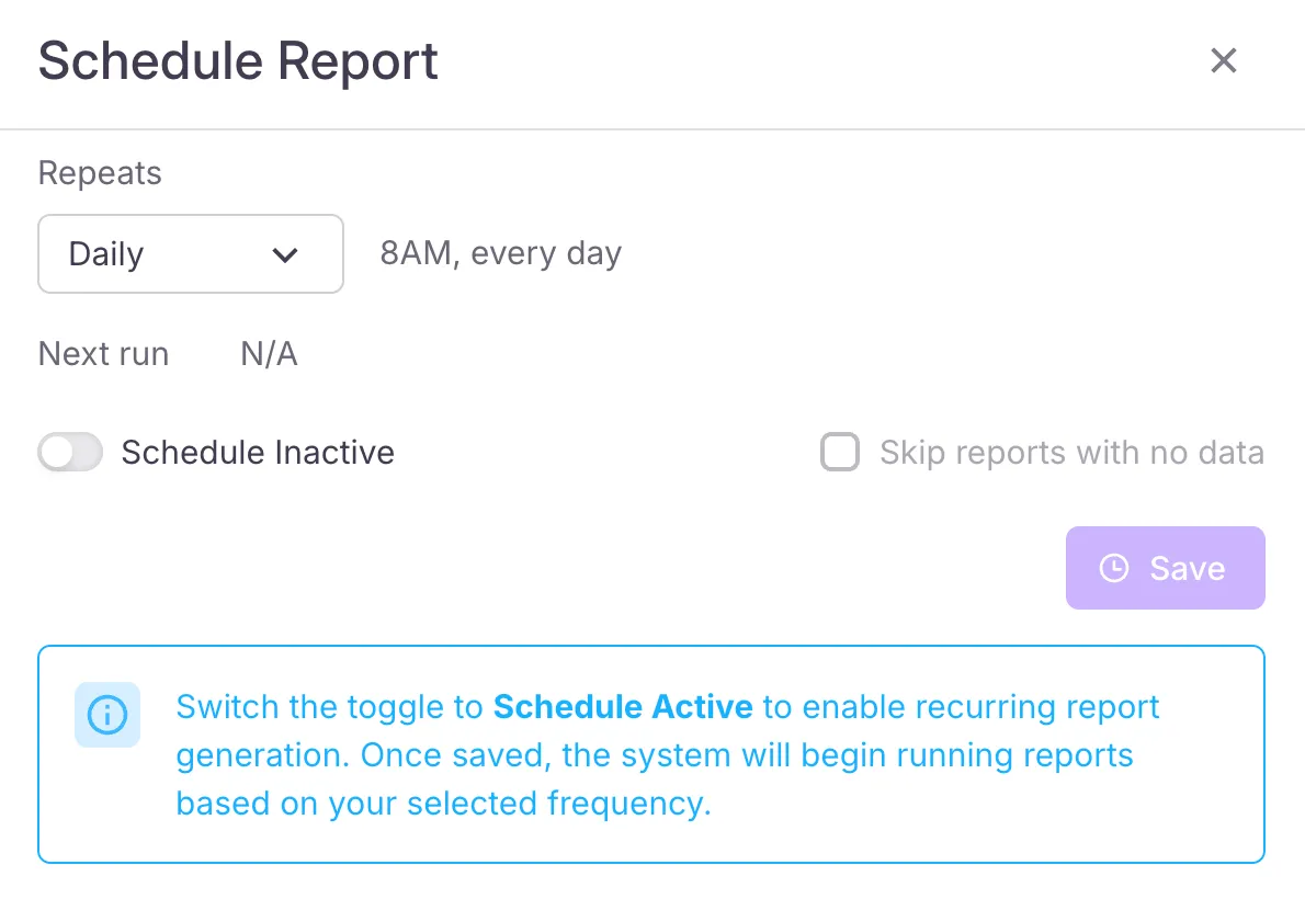
Schedule: Set a schedule to regularly generate a report based on the view. These appear on the Reports page under the Scheduled section. Make sure you toggle on scheduling to activate it.
-
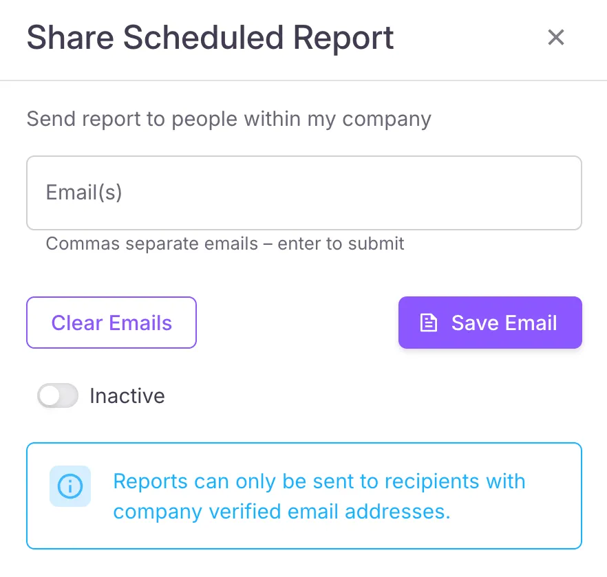
Share: Automatically share generated reports (both one-time and scheduled) to the email addresses you provide. Make sure you toggle on sharing to activate it.
Chart
The Chart Settings widget compiles your traffic data into a visualization of trends over time.
If you are viewing Aggregate data with at least one field and metric selected, your view will generate a chart and a data table after you click Run.
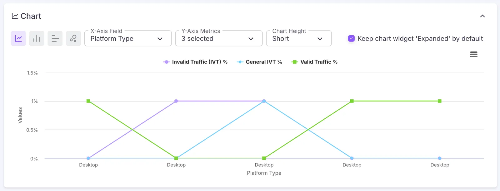
You can customize the chart with the following settings:
- Chart type
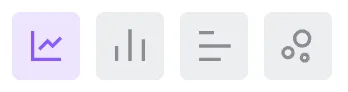 : Switch between visual chart styles.
 - X-Axis Field: Choose the category or variable you’d like to track across the bottom.
- Y-Axis Field: Choose one or more events or outputs to measure against the X-Axis field. You can toggle each Y-Axis field on the chart by clicking on it.
- Chart Height: Select how tall you want the chart to appear.
Hover over any point on the graph to see the timestamp and exact percentage of events associated with that point.
After customizing, you can click the more options icon  to view the chart in full screen, print it, or export it as an image.
Data Table
The traffic summary table provides a detailed breakdown of your selected time frame. You can select different column headers to sort the data by that metric in ascending or descending order.
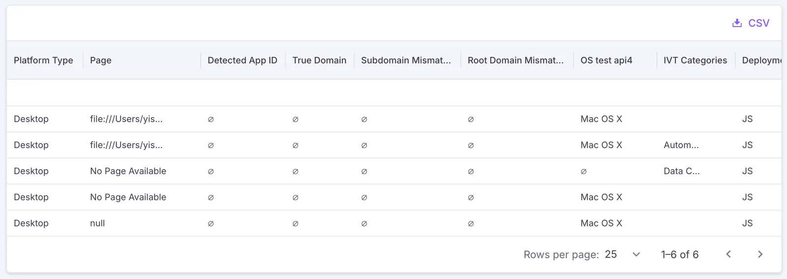
Click the download icon  to export the table as a CSV file.
Explore views have a display limit of 500 rows.