Create Custom Data Views
Dive deep into HUMAN-detected trends by creating your own customizable tables and graphs.
You can create custom views of your data on the Explore page of the HUMAN Dashboard to visualize the traffic data analyzed by each of HUMAN’s products. The Explore page includes options for choosing which data to include in these views and lets you create and schedule reports based on view data.
Create a data view
Follow these steps to create a new data view.
Create a new view
Click + Add new to create a new data view. This generates a template that you can customize as needed.

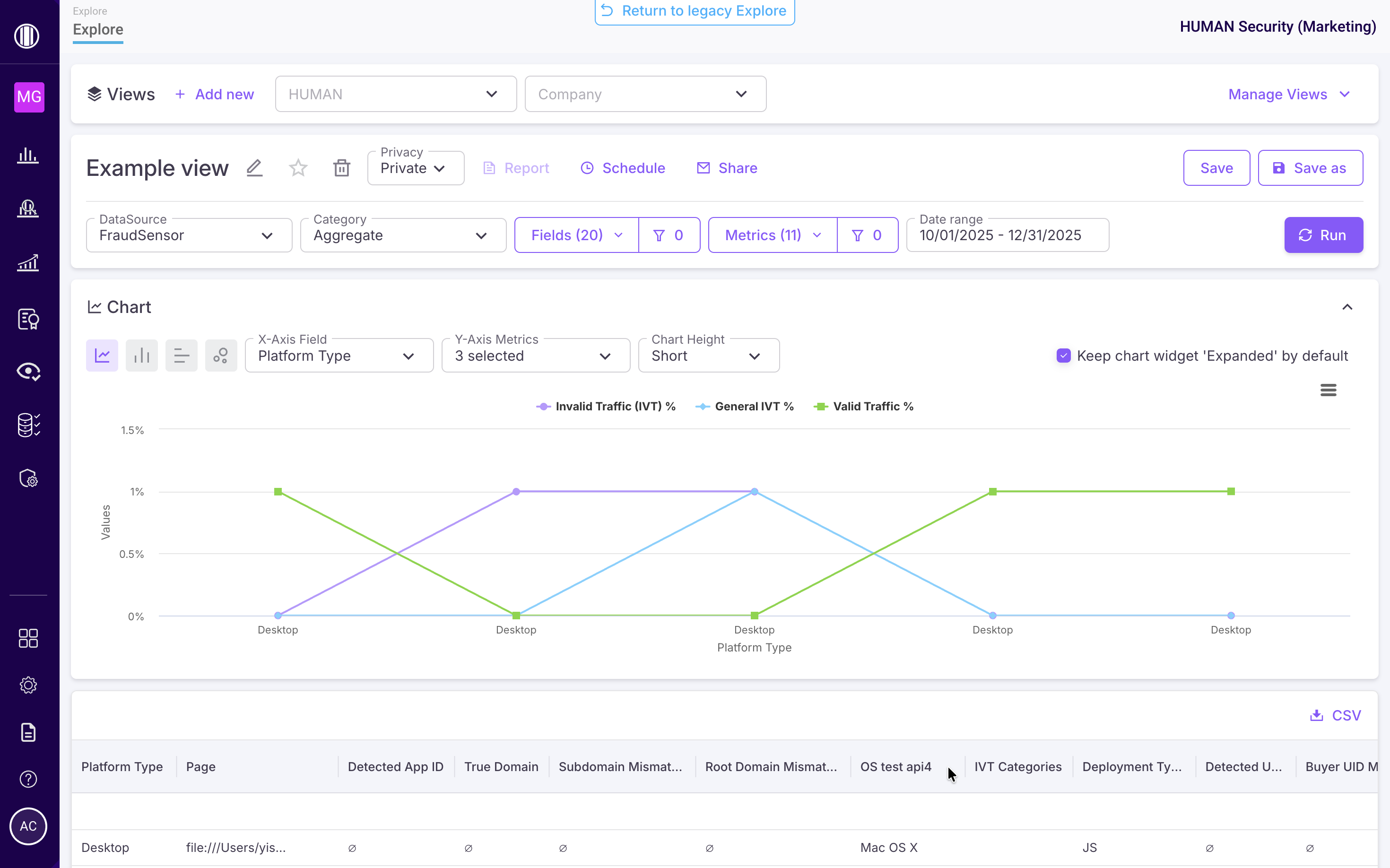
Customize view settings & data
You can customize your view in settings section.
These include:
- View name: The name of your view. You can edit this by clicking the
 button. We recommend you choose a name that reflects the overall purpose or function of your view.
 - Set default: Toggle on the
 to set this view as the default one that appears when navigating to the Explore page.
 - Delete view: Click
 to delete this view.
 - Privacy: Choose whether to make the view only available to your account or to your entire organization. If you share the view, other members of your organization can access the view, edit it, clone it, and create reports from it.
- Report: Generate a one-time report based on the data view. The generated report appears on the Reports page under the Ad Hoc section. You can’t generate a report until after you save your view for the first time. Reports are always based off of the last saved version of the view.
- Schedule: Set a schedule to regularly generate a report based on the view. These reports appear in the Reports page under the Scheduled section. Make sure you toggle on scheduling to activate it.
- Share: Automatically share generated reports, including one-time and scheduled reports, to the emails you provide here. Make sure you toggle on sharing to activate it.
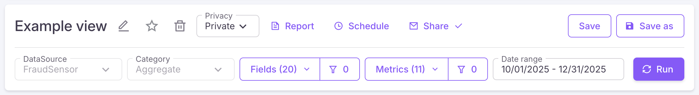
- Save: Save the view and any changes you’ve made to it.
- Save as: Save a copy of the current view under a new name.
- DataSource: If you’re using multiple HUMAN products, choose which product’s data to include in your view.
- Category: Certain DataSoruces let you choose between Transactional data or Aggregate data.
- Transactional: Lists every recorded event as a discrete data point. Some customization options, like filters and metrics, may not be available for Transactional views.
- Aggregate: Highlights general trends and traffic patterns.
- Fields & field filters: Choose the fields to include in your view. For example, you might want to group data by user platform, campaign ID, or device type. You can select a category to include all fields in that category. You can also apply filters
 to further customize your view.
Traffic visualization charts only display when you select one or more fields for your view, since these fields are used to populate the chart’s data.
- Metrics & metric filters: Choose the metrics to include in your view. Metrics provide further insight into a selected field. These are only available for Aggregate data. You can also apply filters to further customize your view.
- Date range: Set the time frame of your view either by selecting one of several preset date ranges or by selecting a custom date range on the calendar.
Run the view
Click Run to fetch the data associated with your view.
If you ever make changes to your view, be sure to click Run again to update your data.
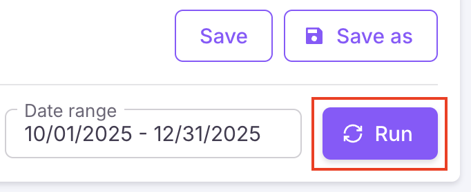
Interpret the view chart
A view cannot provide a data visualization chart for Transactional data. Charts are only available for Aggregate data with at least one field and metric selected.
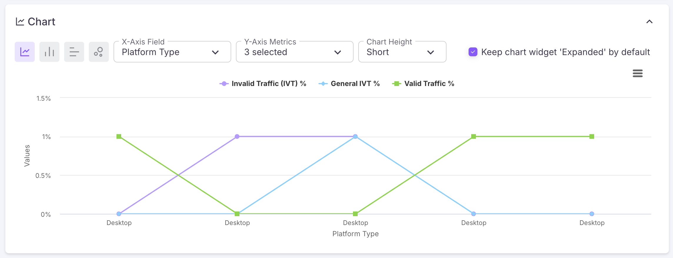
If you’re viewing Aggregate data, your view will generate a chart after your click Run. This visualization compiles your traffic data into a simple chart that displays trends over time.
You can customize the chart with the following:
- Chart type: Click the corresponding chart type
 to switch between them.
 - X-Axis Field: Choose the category or variable you’d like to track in the chart.
- Y-Axis Field: Choose one or more events or outputs to measure against the x-axis field.
- Chart Height: Select how tall you want the chart to appear.
You can also toggle each Y-Axis field on the chart by clicking on it or hover over any point on the graph to see the timestamp and percentage of events associated with that point.
After you’ve customized the chart, you can click ![]() and choose to view the chart in full screen, print it, or export it as an image.
and choose to view the chart in full screen, print it, or export it as an image.
Review the traffic summary
The traffic summary table is a detailed breakdown of your site’s traffic during the selected time frame. Its rows and columns correspond to the fields, filters, and metrics you chose for your view. You can select different column headers to sort the data by that metric in ascending or descending order. You can also click ![]() to export the table as a CSV file.
to export the table as a CSV file.
Explore views can display a maximum of 500 rows. If your traffic summary table exceeds this limit, only 500 rows are shown.
Manage existing views
You can adjust the parameters of an existing data view or use Save as to create and make changes in a copy.
If you update or rename an existing custom view, any saved changes overwrite the old view. This means that if you overwrite a view, you won’t be able to retrieve previous versions of that view.
- Select a view from the dropdown menu or select Manage Views to choose from a list of all views.

- Click Save as and give the view a new name. This creates a copy of the chosen view.
- Make any desired changes and select Save.