About the Accounts Overview dashboard
The Accounts Overview dashboard summarizes all account-related activity and incidents in your applications. This includes incidents such as account takeover or fake accounts. This is a great way to monitor your accounts activity, mitigation, and incidents over time. You can also go directly to the Recent Attacks dashboard to address flagged incidents as needed.
Automatically mitigated account statistics and Network events only appear if you configure mitigation actions or Network event-type rules in your Accounts Policy Rules.
You can access this dashboard from Sightline Cyberfraud Defense > Explore > Visitors > Accounts Overview. You can learn about the available dashboard components with this article.
Filters
You can apply filters to customize the data that appears in Accounts Overview. These filters affect all components in the Overview.
![]()
Overall traffic statistics
You can find overall statistics summarizing your applications’ account activities.

There are three types of statistics:
- Monitored: Shows the total number of activities, accounts, and device fingerprints that Sightline detected over your selected time period.
- Detected: Shows the number of flagged activities and flagged accounts that Sightline saw over your selected time period.
- Flagged activities: Activities matched on policy rules
- Flagged accounts: Accounts that had flagged activity but were not automatically mitigated based on your policy rules.
- Mitigated: Shows the number of automated mitigation events, which happen based on your Accounts Policy Rules, and the number of currently pending incidents. You can click Currently pending to open the Recent Attacks dashboard.
Traffic Over Time and Distribution
You can observe Accounts and Activities over your selected time period and the distribution of each by toggling between them.
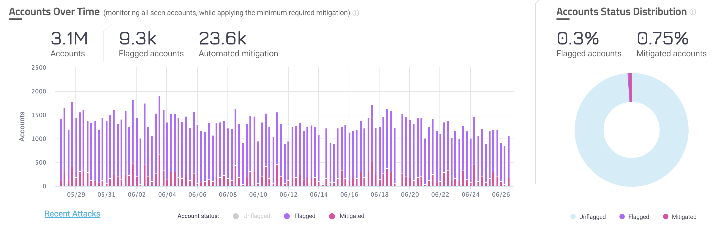
Accounts
The Accounts Over Time graph shows accounts related traffic, including your total accounts, flagged accounts, and automatically mitigated accounts. These amounts are the distinct amount of accounts over the full time range, meaning that each account is only counted once for these statistics.
Meanwhile, each bar in the graph represents the total number of accounts per status at that moment in time, and accounts can be flagged multiple times. This means that if the same account is flagged once per day for three consecutive days, then it will count towards the total number of flagged accounts for each of those days.
You can click each type of account status at the bottom of the graph to add or remove that type from view. You can also click Recent Attacks to navigate to the Recent Attacks dashboard to learn more about the specific incidents that occurred.
The Account Status Distribution chart shows the ratio of unflagged accounts to flagged and mitigated accounts. Similarly to the overall statistics in the Accounts Over Time graph, the Distribution is based on the number of distinct accounts over the full time period. This means that it counts each account once, even if the same account could be flagged multiple times. This is useful for learning the ratio of accounts that have suspicious behavior against the number of accounts that were already mitigated and are legitimate.
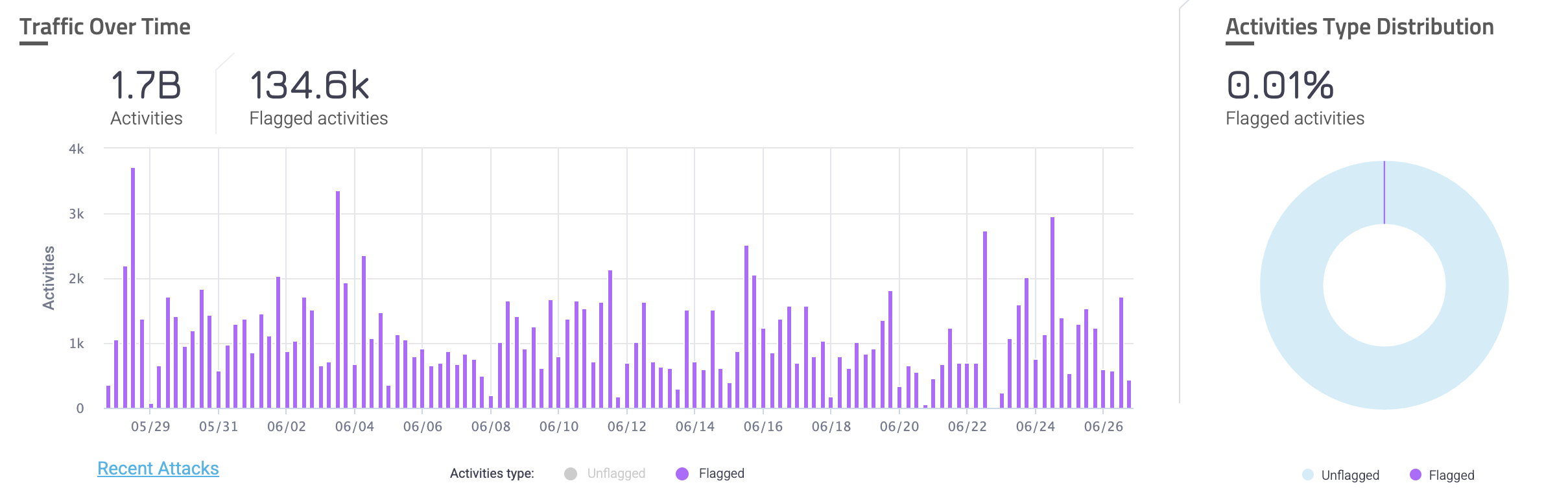
Activities
The Traffic Over Time graph shows unflagged activities and flagged activities over time. This is useful for observing the overall trend of unflagged activity on your applications and take action if you see any unusual behavior.
You can click each type of activity at the bottom of the graph to add or remove that type from view. You can also click Recent Attacks to navigate to the Recent Attacks dashboard to learn more about the specific incidents that occurred.
The Activities Type Distribution chart shows the ratio of unflagged activities to flagged activities. This is useful for learning the ratio of activities that were suspicious against the number of legitimate activities on your application.
Automated Mitigation Over Time
Automated Mitigation Over Time graphs display the number of Accounts that were mitigated or the number of Actions that were used to mitigate incidents over time. You can toggle between these views by clicking on each one.
The Accounts Overview dashboard shows two different Automated Mitigation Over Time graphs depending on the Attack Type you selected in your Filters.
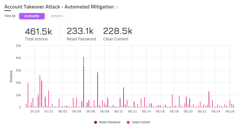
Account Takeover
The Account Takeover Attack - Automated Mitigation Over Time graph appears when you have Account Takeover attacks selected in your filters. It’s useful for tracking how Account Takeover (ATO) attacks affect your application over a period of time and how they are mitigated. Depending on your selection, this graph can show slightly different contexts about ATO.
- Accounts view: Displays the number of accounts affected by ATO attacks over the selected time period. It also shows the number of accounts that were mitigated by either reset password or clean content.
- Actions view: Displays the number of mitigating actions that were taken due to ATO attacks over the selected time period, as well as the number of actions that were either reset password or clean content. Mitigating actions can occur multiple times on a single account, so you may notice that the total number of actions may be larger than the number of accounts.
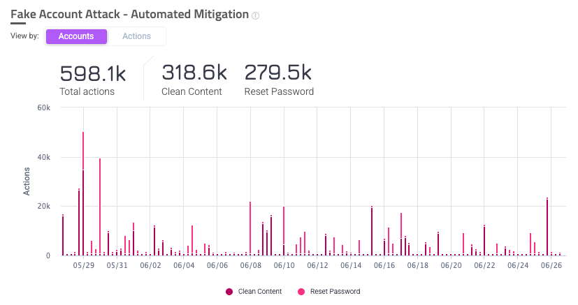
Fake Account
The Fake Account Attack - Automated Mitigation Over Time graph appears when you have Fake Account attacks selected in your filters. It’s useful for tracking how Fake Account (FA) attacks affect your application over a period of time and how they are mitigated. Depending on your selection, this graph can show slightly different contexts about FA.
- Accounts view: Displays the number of accounts affected by FA attacks over the selected time period. It also shows the number of accounts that were mitigated by either reset password or clean content.
- Actions view: Displays the number of mitigating actions that were taken due to FA attacks over the selected time period, as well as the number of actions that were either reset password or clean content. Mitigating actions can occur multiple times on a single account, so you may notice that the total number of actions may be larger than the number of accounts.
Flagged Activities Distribution
The Flagged Activities Distribution chart gives a detailed breakdown of the flagged activities Sightline detected per attack type. This is useful for learning about what types of events are most common in your application and lets you plan mitigation actions if needed.
The Accounts Overview dashboard shows two different Flagged Activities Distribution charts depending on the Attack Type you selected in your Filters.
Account Takeover
The Account Takeover - Flagged Activities chart appears when you have Account Takeover attacks selected in your filters. It shows a distribution of activities that Sightline flagged as ATO. You can hover over a section of the chart to show a more detailed breakdown of the behavior.
Fake Account
The Fake Account - Flagged Activities chart appears when you have Fake Account attacks selected in your filters. It shows a distribution of activities that Sightline flagged as FA. You can hover over a section of the chart to show a more detailed breakdown of the behavior.
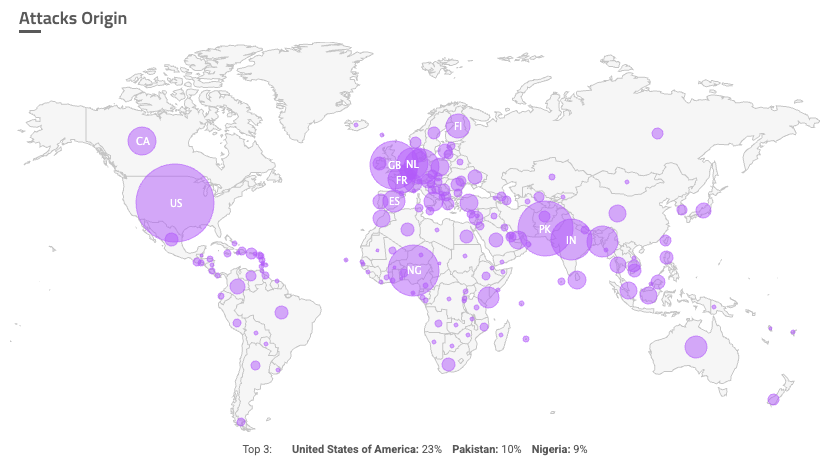
Attacks Origin
Attacks Origin shows the countries that Sightline believes the attacks originated from. A greater concentration of attacks corresponds to a larger circle from the country. The bottom of the map shows the top three most common countries, but you can also hover over each country to show the exact percentage of attacks that came from there.
Trust Indicators
The Trust Indicators chart shows the distribution of indicators associated with activities with certain risk scores. You can choose to view indicators for activities with risk scores greater than or equal to 90, 80, or 0. This is useful for learning more about how activities were classified and which indicators are prevalent on your application.
Indicators are categorized by Email domain and IP address.
Overview
The Overview area has three sections that display information about Single and Network attacks on your application. While a Single event is an isolated incident, a Network event refers to a group of shared identifiers, compromised accounts, and fake accounts that helps understand large-scale abuse.
You can learn more about Single and Network events with our Investigate Account Takeover incidents or Investigate Fake Accounts incidents articles.
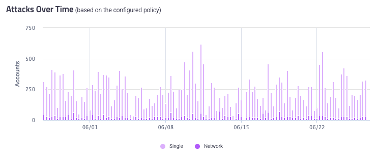
Attacks Over Time
The Attacks Over Time graph shows the total number of attacks, both Single and Network, that Sightline detected over the selected time period. This graph is useful for tracking the frequency of attacks over time and the types of attacks.
You can hover over each bar to see a detailed breakdown of attacks at that point in time. You can also click each attack type at the bottom of the graph to toggle them from the graph view.
Attack Type Distribution
The Attack Type Distribution chart gives a detailed breakdown of the attacks by attack type that Sightline detected over the selected time period. This is great for seeing the ratio of Single to Network attacks in your application. This distribution also shows a precise number of each attack type.
Network Attacks
The Network Attacks distribution chart is a breakdown of Network attack identifiers. Network attacks are events with linked identifiers, compromised accounts, and fake accounts, and network type identifiers help categorize different Network events. You can also see the number of accounts affected by Network events and the average attack size.