FraudSensor Dashboard
FraudSensor is HUMAN's post-bid advertising solution for detecting fraudulent ad impressions.
FraudSensor’s Executive Summary page provides an overview of your ads traffic in near-real time. In addition to the standard Executive Summary functionality shared across all HUMAN products, this page offers several elements specific to FraudSensor’s capabilities.
Filters
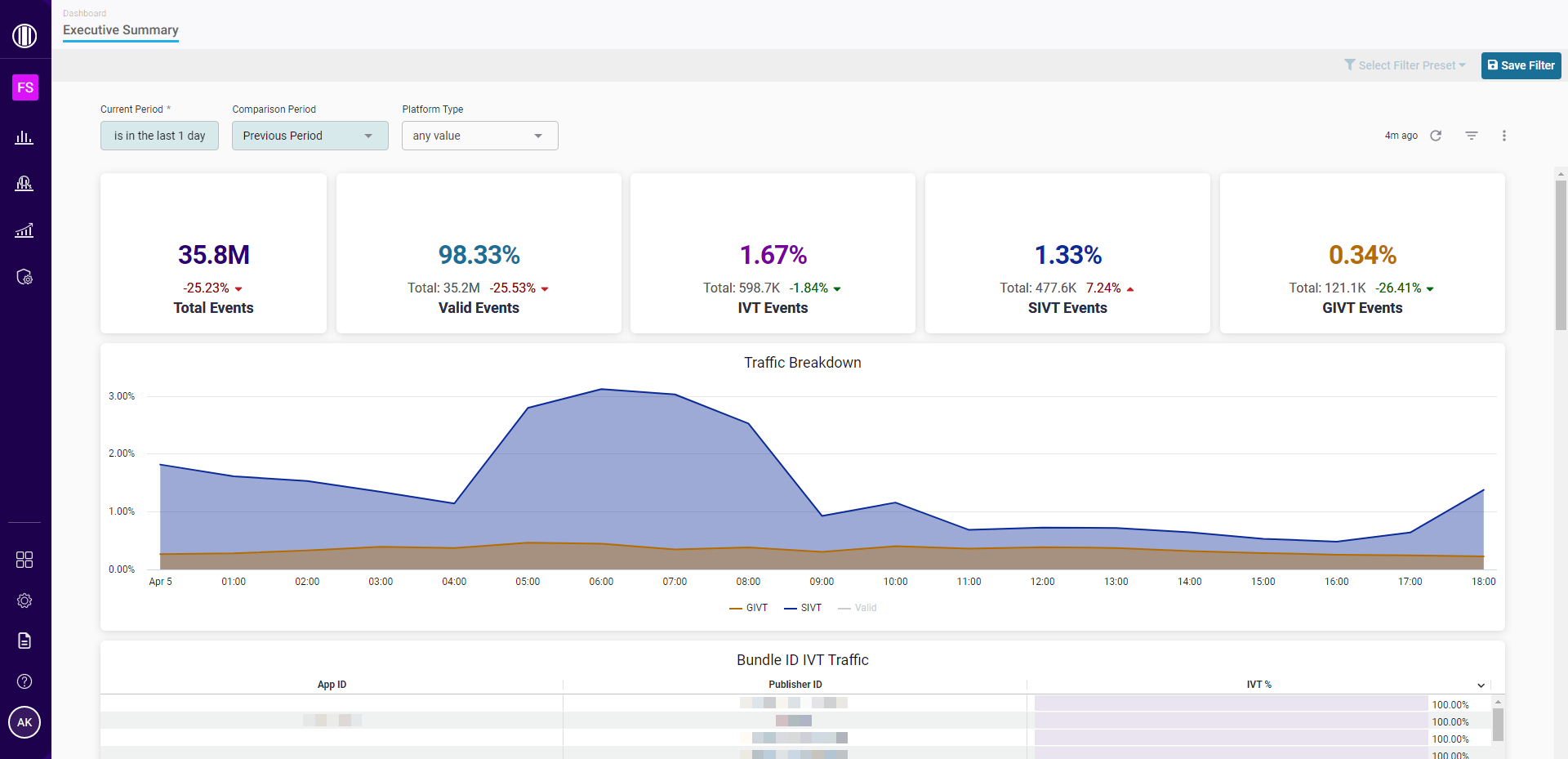
You can use filters to customize the data displayed on FraudSensor’s Executive Summary page. These filters include:
- Current Period: The time period for which traffic data will be displayed.
- Comparison Period: The time period to which current traffic data will be compared (as percentage-over-time trends).
- Platform Type: The platform where an event occurred.
Tip
For the Current Period filter, the
is in the lastconstraint calculates time periods using calendar benchmarks rather than counting backwards from the date and time at which the filter is created.For example, if you create a filter to show data within the past month, you will see data starting from the 1st day of the current calendar month rather than data from the past 30 days. As a result, you may see empty data for the remaining part of the month that has yet to occur. The same time period logic applies to days (which start at midnight), weeks (which start on Monday), and years (which start on January 1st).
To create week or month filters that count backwards from the current date and time, you can create a filter for
is in the last <7 days>oris in the last <30 days>instead.
After you’ve adjusted these filters, select ![]() to update your FraudSensor data.
to update your FraudSensor data.
Traffic overview
FraudSensor’s Executive Summary page includes multiple breakdowns of the traffic data that meets the conditions of your applied filters. However, certain data visualizations may vary depending on whether you’re viewing DSP/SSP data or brand data.
Traffic metrics
A traffic breakdown by event category. These breakdowns include event percentages, event totals, and percentage trends over time.
- Total Events: The total number of recorded events during the selected time frame.
- Valid Events: The percentage and number of events that were determined to be valid.
- IVT Events: The percentage and number of events that HUMAN flagged as invalid traffic (IVT). This percentage is the combined total of sophisticated invalid traffic (SIVT) and general invalid traffic (GIVT) events.
- SIVT Events: The percentage and number of events that HUMAN flagged as sophisticated invalid traffic (SIVT).
- GIVT Events: The percentage and number of events that HUMAN flagged as general invalid traffic (GIVT).
Note
Any increase in the percentage of Valid Events is highlighted in green, since this positively impacts the quality of your overall traffic. Any increase in the percentage of IVT, SIVT, or GIVT Events is highlighted in red, since this negatively impacts the quality of your overall traffic.
Traffic Breakdown
A graph that displays the percent of events over time that were classified as Valid, SIVT, and GIVT. You can hover over any point on the graph to view the timestamp and percentage of events associated with that data point, or select any labels below the graph to show/hide that category’s data in the visualization.
Bundle ID IVT Traffic
A table with detailed information about the app bundles that had the highest percentage of IVT.
Supplier ID (DSP/SSP only)
A table with detailed information about the suppliers who drove the most invalid events, with additional data about the percentage and number of events that were categorized as IVT, SIVT, and GIVT.
Prevention Coverage (DSP/SSP only)
A graph that displays the number of events over time that were measured by MediaGuard’s pre-bid solution, if applicable, as well as the overall percentage and number of events that were measured by MediaGuard during the selected time frame.
Advertiser ID (brand only)
A table with detailed information about the ad creative that drove the most invalid events, with additional data about the percentage and number of events that were categorized as IVT, SIVT, and GIVT.
Campaign ID (brand only)
A table with detailed information about the ad campaigns that drove the most invalid events, with additional data about the percentage and number of events that were categorized as IVT, SIVT, and GIVT.
Placement ID (brand only)
A table with detailed information about the ad placements that drove the most invalid events, with additional data about the percentage and number of events that were categorized as IVT, SIVT, and GIVT.
Publisher ID
A table with detailed information about the publishers who drove the most invalid events, with additional data about the percentage and number of events that were categorized as IVT, SIVT, and GIVT.
IVT Category Events
A chart that displays the IVT categories detected by HUMAN, broken down by the number of invalid events per category that occurred on each platform.
You can hover over any section of the chart to view the percentage and number of events associated with that platform and IVT category, or select any of the labels below the graph to show/hide that IVT category’s data in the visualization.
Device Traffic
A chart that displays the percentage of SIVT, GIVT, and Valid events associated with each device type's total traffic. You can hover over any section of the chart to view the timestamp and percentage/number of events associated with that device type and threat category, or select any of the labels below the graph to show/hide that category’s data in the visualization.
OS Traffic
A chart that displays the percentage of SIVT, GIVT, and Valid events associated with each operating system (OS)'s total traffic. For example, if 70% of your traffic from Linux devices was invalid, Linux may appear on this chart even if only a small portion of your overall traffic is driven by Linux devices.
You can hover over any section of the chart to view the percentage/number of events associated with that OS and threat category, or select any of the labels below the graph to show/hide that category’s data in the visualization.
Updated 18 days ago